As dining discovery spans multiple platforms, 60% of users naturally switch devices during their decision journey, yet 79% abandon websites that deliver fragmented cross-device experiences. Menu Mate’s responsive website solves this problem by creating a seamless experience that enables premium restaurant discovery and reservations across all devices.
My Role
This project challenged me to adapt an existing mobile app experience for responsive web design. As the sole designer, I led the entire design thinking process, from IA to high-fidelity prototypes and cross-device testing, completed as part of Google's UX Design Professional Certificate.
Process & Deliverables
Leveraged prior research and conducted a usability study
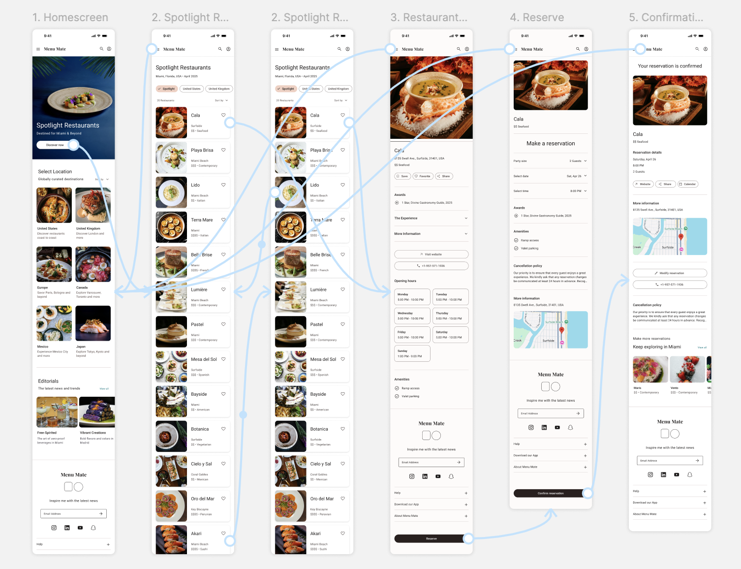
Developed responsive IA and user flows
Created wireframes and refined visual components
Designed high-fidelity prototypes
Extended design system with responsive components
Background
Leveraging user research from my previous mobile app project, I designed a responsive website to extend a restaurant discovery and booking experience across devices and screen sizes. This case study centers on validating whether users can intuitively navigate the main user flow across desktop and mobile interfaces, specifically how easily users can discover restaurants and complete reservations.
The Challenge
Users need a seamless way to discover and book premium restaurants across devices and screen sizes, without sacrificing functionality or ease of use when switching between desktop and mobile.
The Goal
To extend restaurant discovery and booking across desktop and mobile while maintaining the intuitive simplicity of the mobile app.
User Research
To understand user interaction patterns across desktop and mobile interfaces, I conducted a usability study to validate whether the main user flow could be easily completed.
Previous research identified that working adults with time constraints for cooking also struggled with app-toggling inconvenience, irrelevant categories, and missing restaurant contact information when booking dining experiences.
Through my research, I discovered that users naturally switch between devices during restaurant discovery, using mobile for quick searches and desktop for detailed exploration. This validated the need for a responsive website that maintains consistent functionality across all touchpoints.
Sitemap
As the architectural blueprint for the responsive website, this sitemap translates the app’s intuitive, research-informed flow into a flexible cross-device structure.
It prioritizes the primary booking path for immediate access across devices, while secondary features are strategically grouped to preserve navigational clarity. This ensures a consistent user journey and lays the scalable foundation for future growth.
Design Process
My responsive design process focused on creating layouts that adapt to users' natural device-switching patterns. The core challenge was balancing comprehensive restaurant information for desktop users with a focused, streamlined mobile experience.
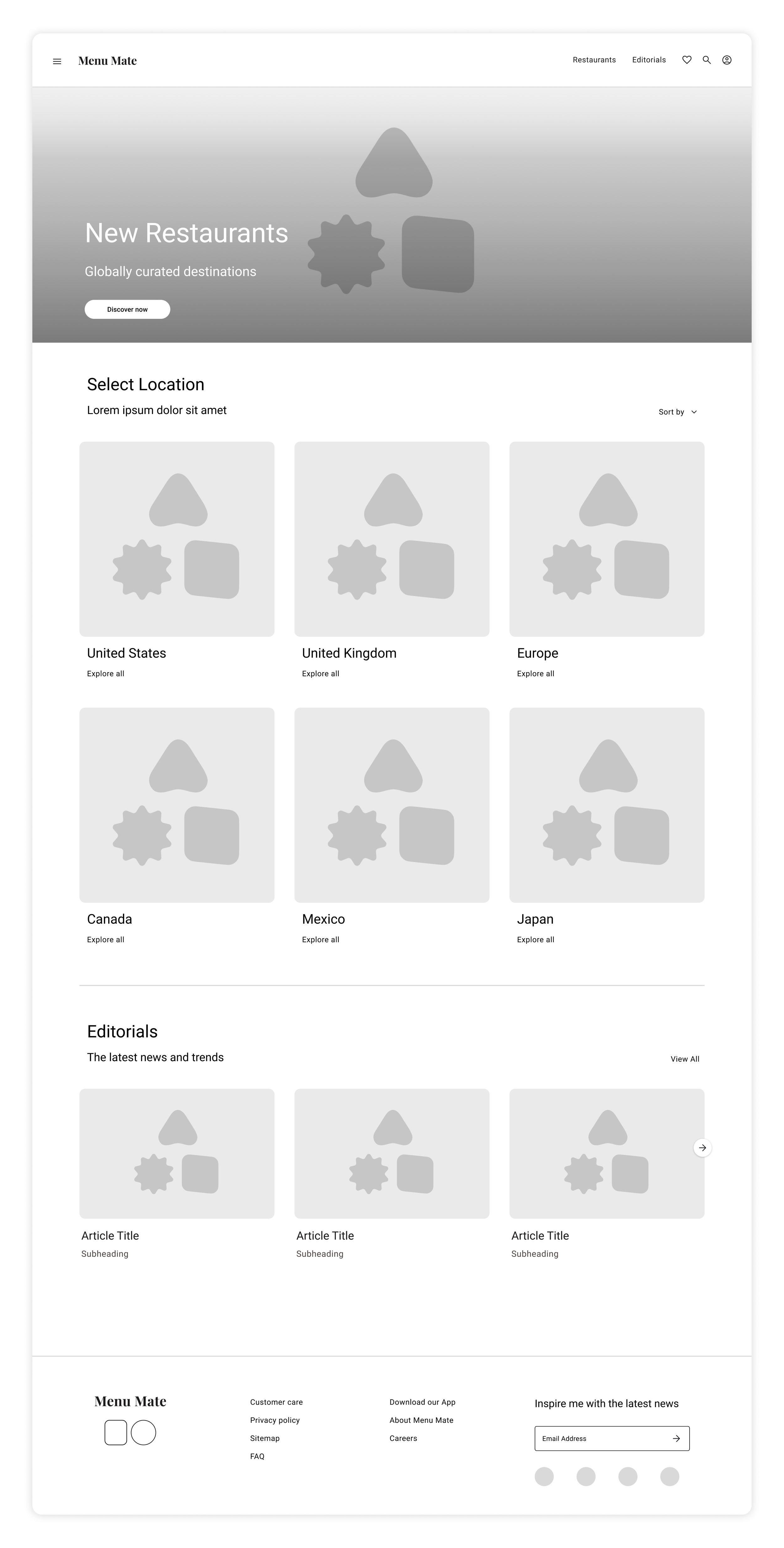
This wireframe demonstrates how responsive content hierarchy efficiently surfaces rich information on larger screens while preserving the concise booking flow across all devices.
Primary CTA positioned above the fold drives immediate engagement while hero imagery establishes brand premium positioning.
Search provides secondary user flow entry. Profile drives account creation for personalized content.
Grid layout maximizes screen real estate to display multiple location options simultaneously, supporting efficient browsing and regional selection.
Usability Study Findings
I conducted one usability study using a low-fidelity prototype to validate core navigation patterns and interaction flows across screen sizes. The study revealed key insights that informed design iterations.
01. Navigation
The active page state in the navigation header lacked sufficient visual distinction, causing confusion about current location
02. Favorites
Users want the ability to save restaurants directly from grid views, not just individual restaurant profiles
03. Engagement
The post-reservation Keep Exploring section appeared visually flat and failed to encourage continued engagement
Mockups
Based on insights from the usability study, I refined the restaurant discovery screen to improve navigation clarity and streamline key interactions. I strengthened the visibility of the active page state to help users stay oriented and introduced quick-save icons within restaurant cards to simplify favoriting.
Before Usability Study
After Usability Study
Mockups
To encourage continued engagement after booking, I redesigned the Keep Exploring section to feel more dynamic and actionable. I introduced visual hierarchy, incorporated imagery, and restructured the layout to surface recommendations more clearly and make them easier to act on.
Before Usability Study
After Usability Study
Mockups: Desktop
Building from the wireframes, I developed polished final designs using Material 3's adaptive system. The desktop interface leverages expanded screen real estate while utilizing progressive disclosure to reveal information as users advance through the flow, maintaining consistent interaction patterns and component behavior throughout.
Mockups: Mobile
High-Fidelity Prototype
I designed final prototypes that demonstrates seamless responsive behavior and validates the user journey across breakpoints. The final design showcases how the interface adapts fluidly between desktop and mobile experiences while maintaining breathable layouts that enhance readability.
Desktop
Mobile
Conclusion
By leveraging existing research and extending restaurant discovery across responsive breakpoints, this project demonstrates how strategic research application can efficiently scale user experiences. The desktop and mobile interfaces accommodate users' cross-device preferences while preserving the intuitive discovery patterns validated through usability testing. This approach highlights the importance of a responsive design strategy in creating cohesive booking experiences that adapt seamlessly to users' natural browsing behaviors.
For more details on my process, please send me a message through the Contact Page.


